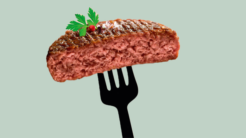
Panic among meat lovers, beef steak threatened by the arrival of very good “meat analogues”! Meat is hooked on punk.

To pay attention, to look after one another, to care for the soul. These last few years, mindful cosmetics have started invading vanities and routines.
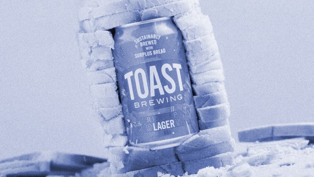
Throwing away food is always painful; we always try to do something with spoiled food to waste as little as possible. French toast is a perfect example of this.